3 developers fullstack
Overview
Mistertemp' is a jobTech company to help clients staffing, for several needs, temporary or permanent, in various fields as industry, medical, accountability, computing. The company have developed a digital platform to facilitate client needs, communication and tasks automation.
Project brief
A large majority of the temporary contrats are based on week. At every end of the week, the customers need to send several timesheets of their temporary employees.
Problem to solve
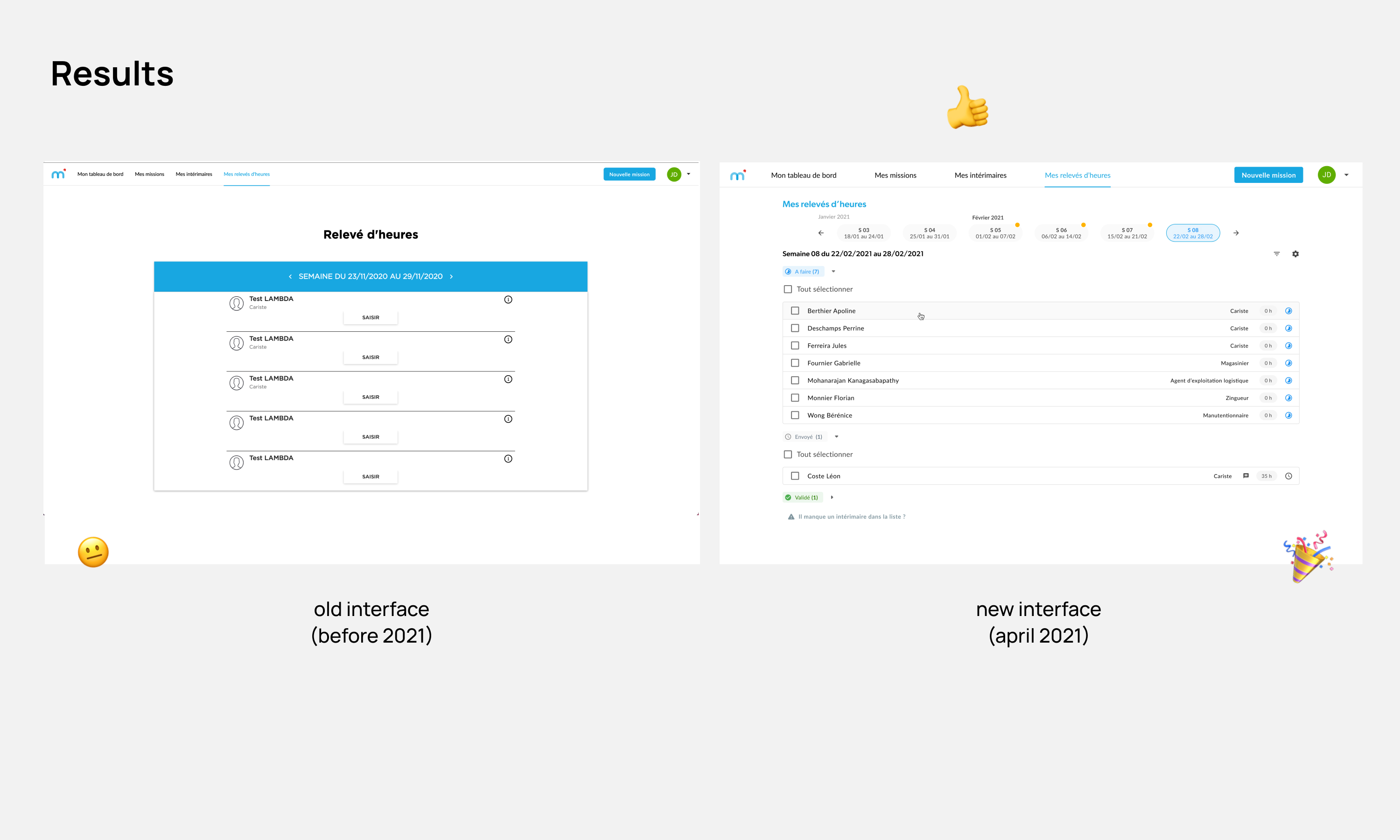
Give the possibility to the customers for completing these timesheets directly on their client platform to facilitate automation and data history. Avoid as much as possible the manual task to copy/paste from an Excel document into an email.
User needs
Using the platform instead email communication to send rapidly the timesheets of the week or current month before the accounting closing.
Pain points
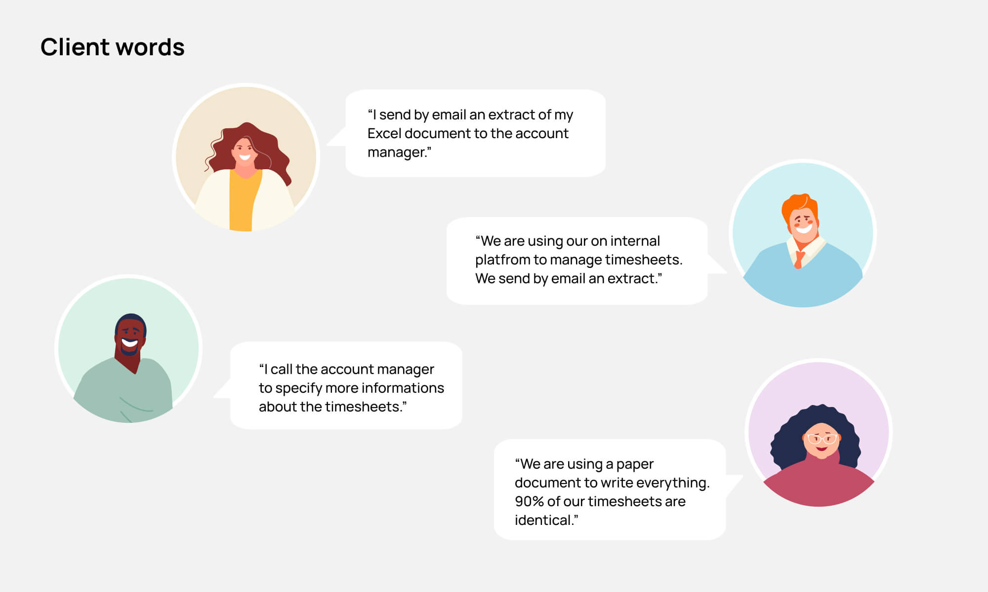
More than 80% of timesheets are sended by email to the account managers with a phone check. Sending timesheets is a redondant and non-pleasant task.
Key Performance Indicator
Give the possibility to the clients for completing these timesheets directly on their client platform to facilitate automation and data history.
Availability
90% of the timesheets are available on the customer plateform
Utilisability
At least 80% of new clients are using the timesheets feature on the plateform
Efficiency
The timehseets should be completed in less than 10 minutes.
The process and methods
A Design Sprint has been planned with articipants from several intern business units to contribute of framing the project with special guests, from external clients.
Discovery
User & stakeholders interviews, User Journey map, surveys, competitive audit
Ideation
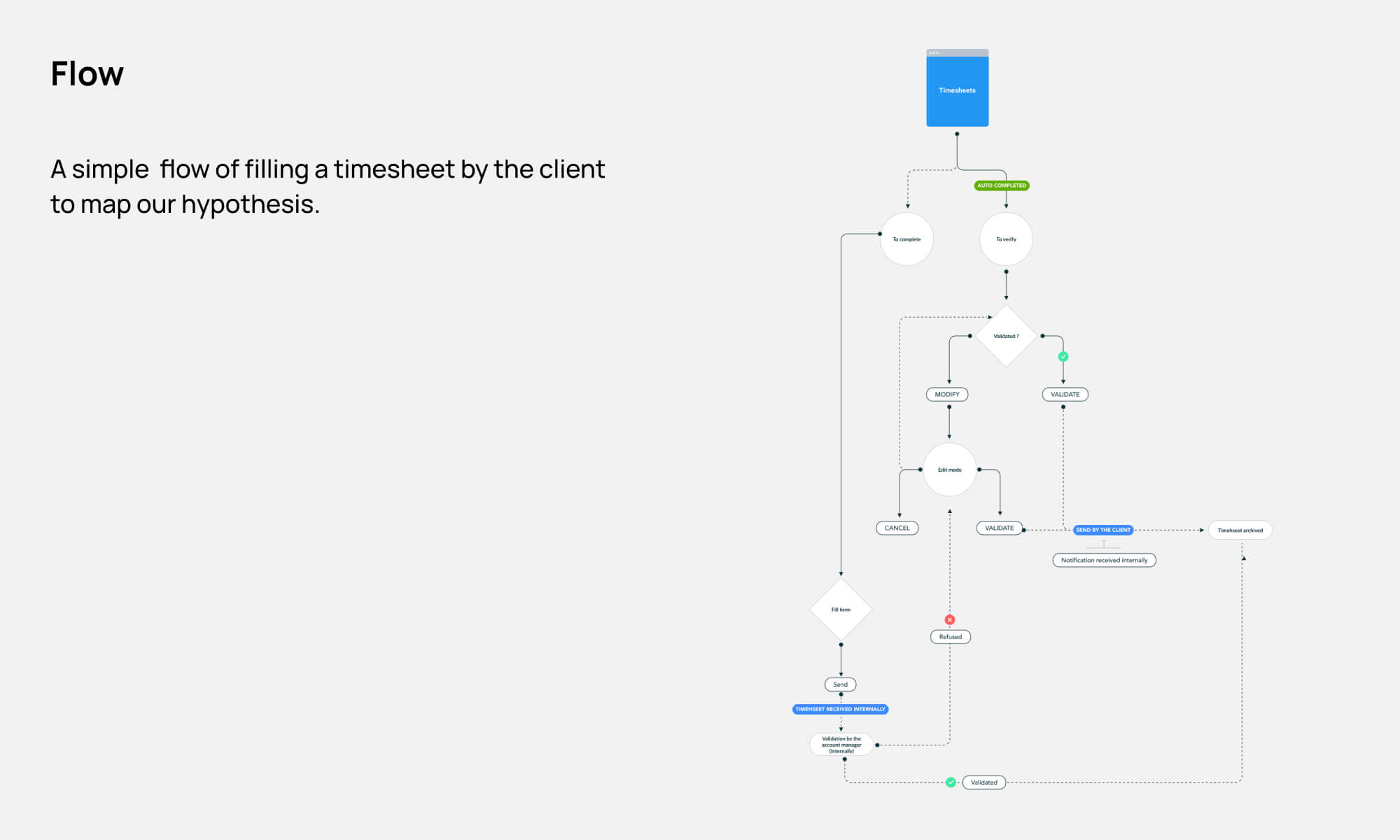
Sketching hypothesis with flows and brainstorming mockups
Testing
Presenting the designs with usability and A/B testing
Delivery
Design specs for developers, implementation and data
Phase 1 • Discovery
After framing the project to build the Epic and establish Jira tickets, we have interviewed a panel of clients to better understanding the needs. Proceed to the creation of an Experience Map and generate hypothesis.
Phase 2 • Ideation
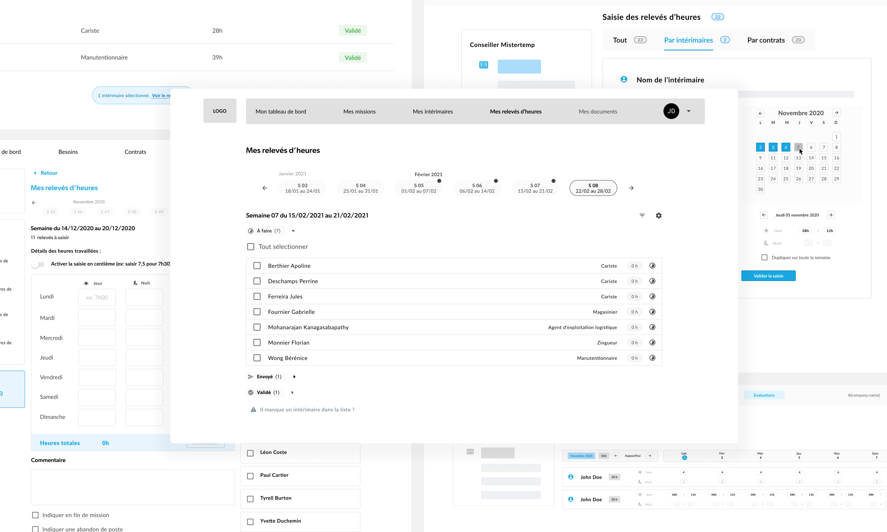
Once hypothesis have been braintormed, the first ideas come up on paper and Figma to translate into design.
Phase 3 • Test
Usability tests with the clients are a method to collect perceptive datas to select the right solution. The tests have been organized in visio session with the client and with screen-sharing to observe the customer behavior and by using online tools (e.g. maze).
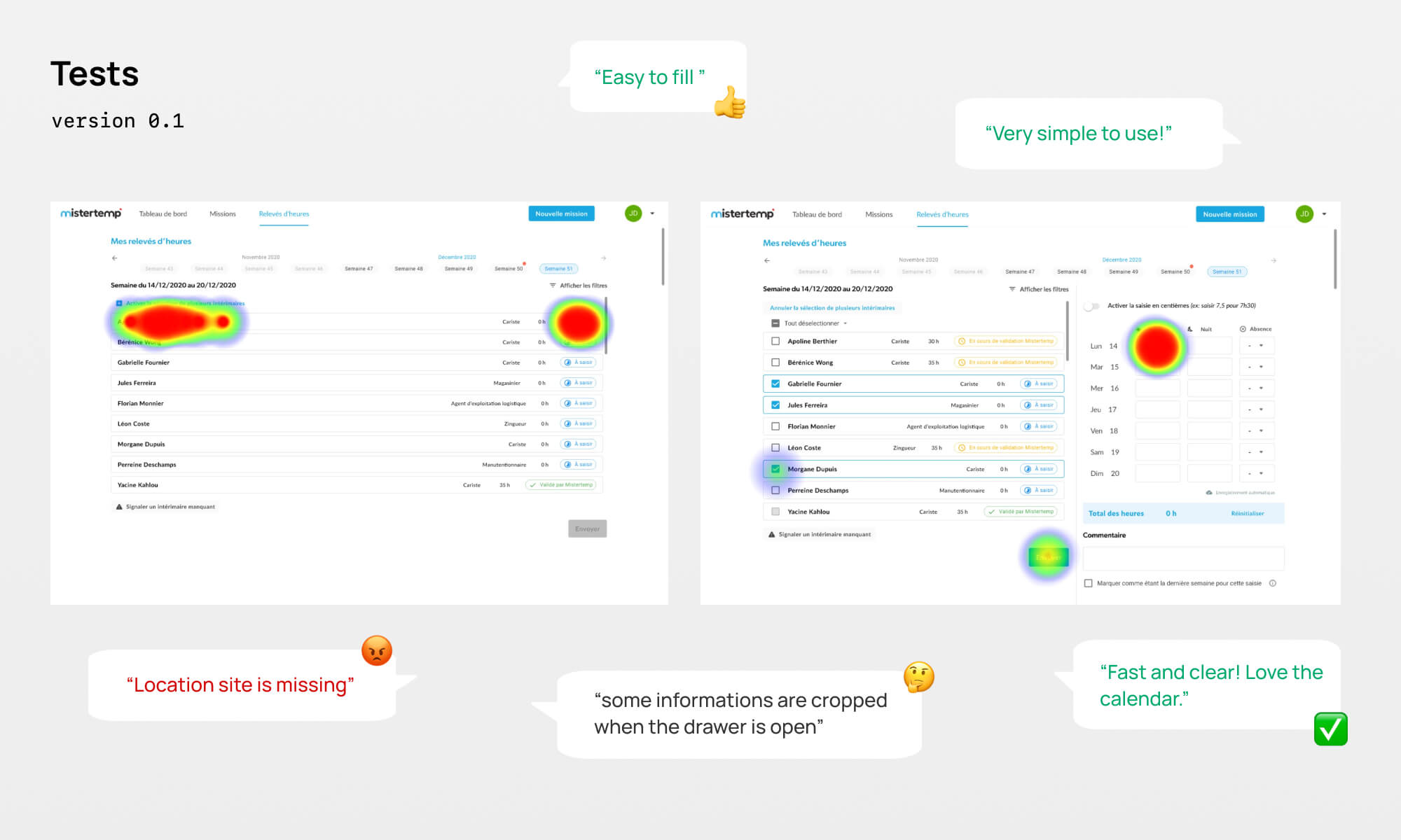
To organize the tests, we have used an internally process to evaluate the different prototypes. 2 different versions with variations have been tested with the clients, we took in consideration their feedbacks to iterate the design and product.
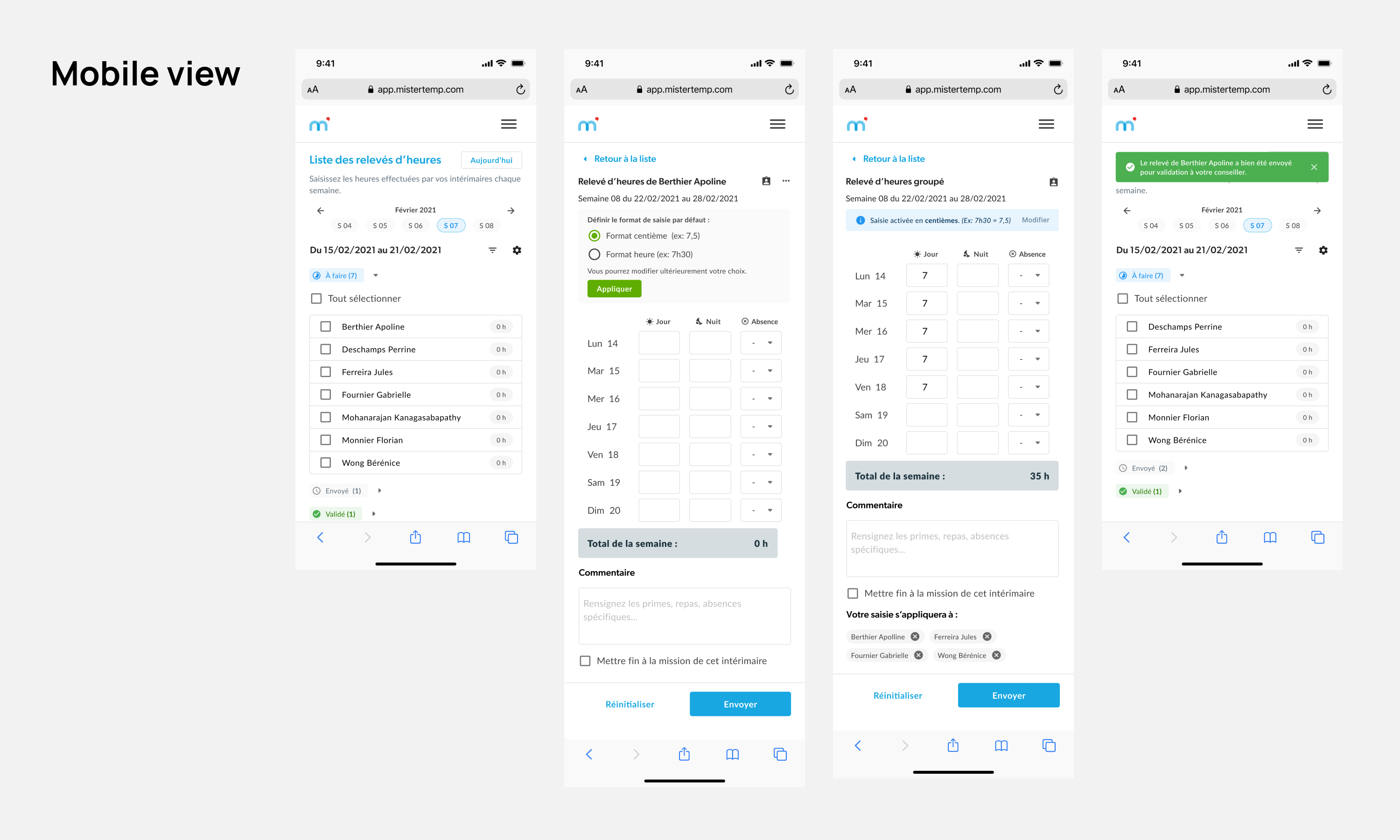
The flow has been reviewed and change to a drawer panel for the hours form completion.
Phase 4 • Delivery
Prepare design specs for launching the first version of the feature, and closely collaborate with developers to implement the design and analytics trackers.
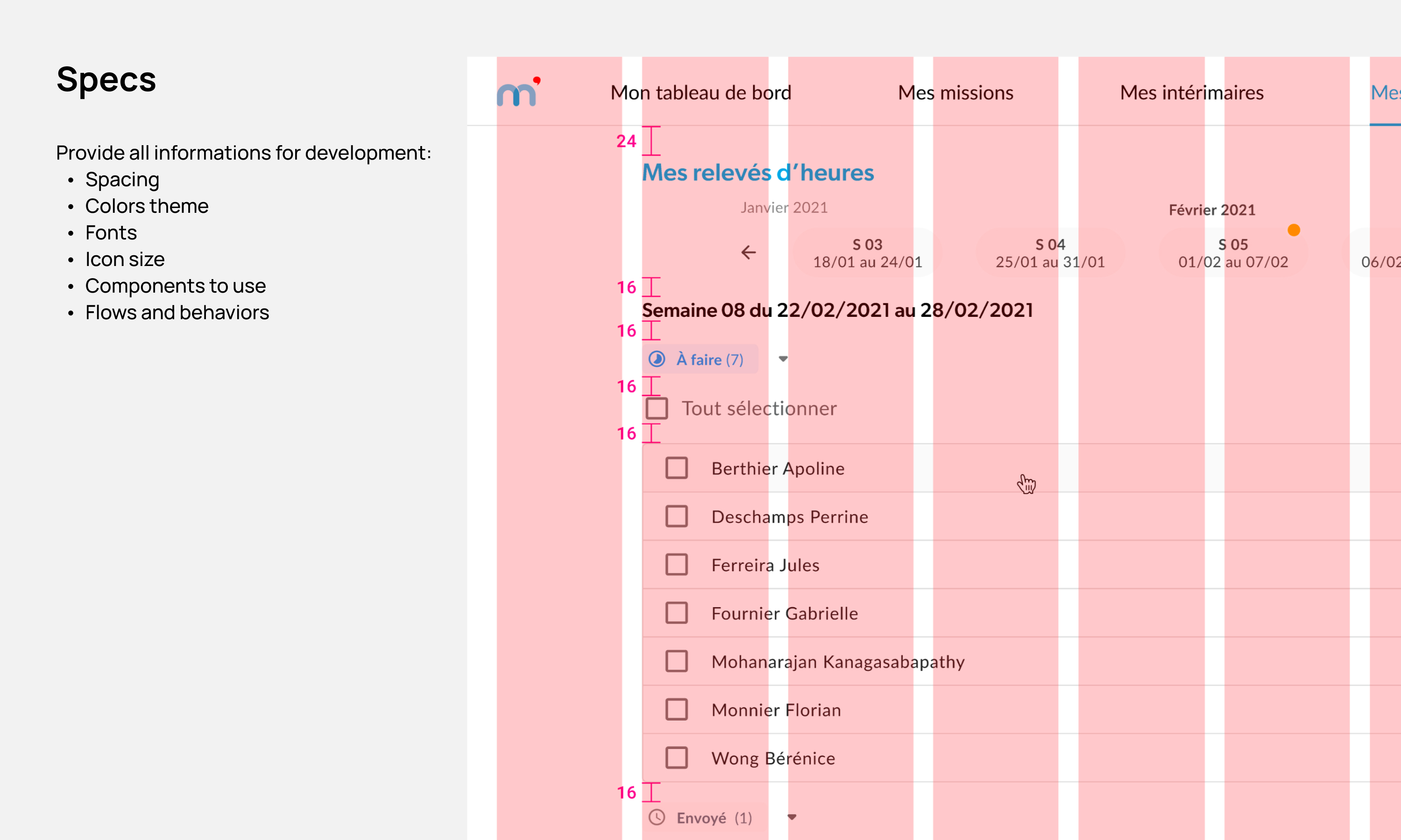
The MVP (v0) is available and we continue to interate and analyse uses.
Screen metrics tracked
To analyse futur needs and customer behavior we implemented trackers for the usage and adoption metrics, client satisfactions, error rate, misclicks, support contact frequency.
Next steps
Potential iteration ready to be implemented concern the import of external document, duplicate data from the previous week, pre-fill with contract informations.
What we've learned
After collecting and reviewing their feebdacks the clients use well this new feature and they love it for the most importance reason : time saving.
Each client had its own way to work and its own internal process. The difficulty with this feature was to provide a smart tool to convince clients to drop down the old way of use with the pencil&paper, scanning it and sending it by e-mail.